Putting together a short video glimpse of The Colors of Antarctica: Straight from Antarctica to You recently was a quiet reminder of how far a project travels between a salt-sprayed camera lens and a finished book. At first glance, naming a black-and-white colouring book after the colours of Antarctica sounds like a gentle contradiction. Yet anyone who has sailed south across the Drake Passage knows that the seventh continent is never merely white: it is mineral cobalt inside compressed icebergs, charcoal volcanic rock, pewter water, and ribbons of green and red aurora australis dancing beneath the Southern Cross as the brief austral summer fades.
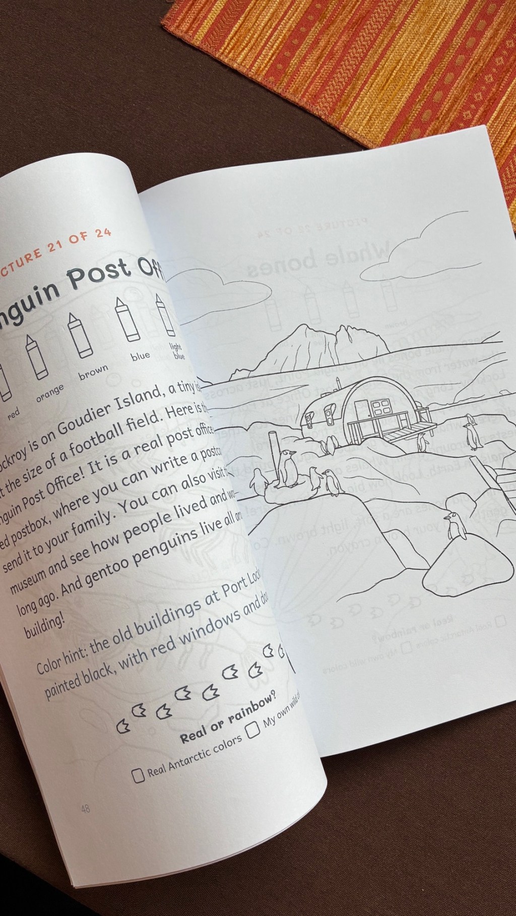
Every illustration in the book began as a real photograph from an Antarctic sailing expedition. Designed for curious readers aged four to ten, each spread pairs a crisp, uncluttered black-and-white drawing with a short field story on the facing page. Rather than relying on generic polar tropes, the sequence follows the arc of an actual voyage south—introducing young minds to real geography and wildlife behaviour, from nesting chinstrap penguins and seals along icy shores to humpback whales surfacing in sheltered coves.
What I enjoyed designing most—and what comes across clearly when flipping through the spreads on video—is the small “Real or rainbow?” choice tucked at the foot of every story page. Alongside simple colour hints drawn from nature, children are invited to decide whether to match the true palette of Antarctica or invent their own—turning a whale’s fluke violet and coral if they wish. Seen on screen, those turning pages capture the quiet purpose behind the project: offering young readers an honest window into the bottom of the world while leaving plenty of room for their own imagination to fill the space.


Leave a Reply